Although I’m a little late to the meme party of the viral #10YearChallenge, I have an interesting list to present. How some of the most popular Indian websites changed in the last 10 years. It’s fascinating to see how and what these websites have transitioned into.
Of course, this list if inspired by an article of the same type by US-based designer Arun Venkatesan. It contains universally popular sites like IMDb.com (with which I share a great bond), Amazon.com, and Facebook to name a few.
Here goes! In no particular order. And best viewed on a wide screen, possibly a desktop or a laptop.
You can directly view the images in this slideshow below or go through the entire article and read my comments.
Flipkart.com
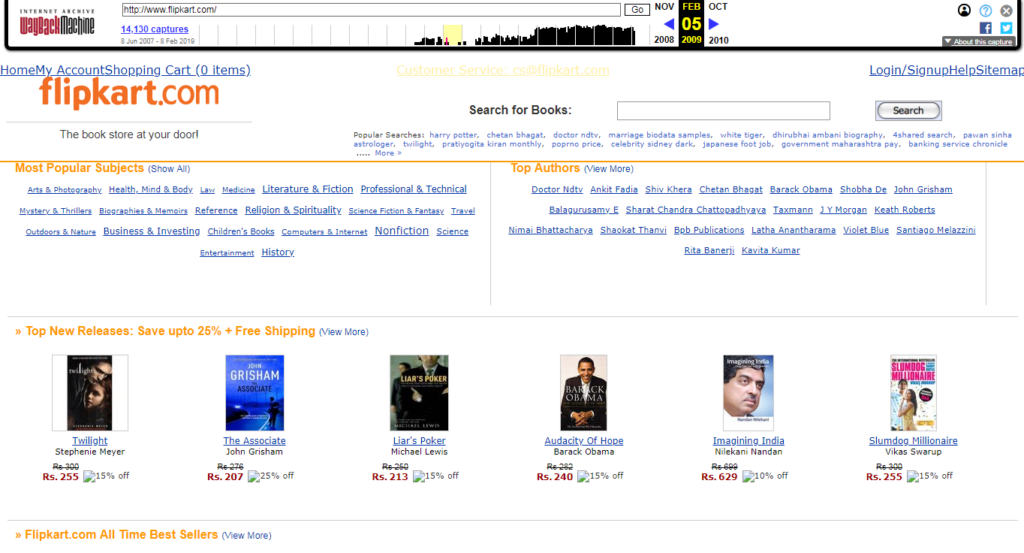
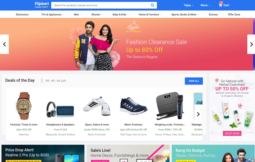
In 2009, Flipkart, like Amazon.com in its infancy, just sold books. Who knew it would raise funds and turn into an ecommerce behemoth? The text logo as well as a strictly HTML interface look so ordinary compared to the extravagant consumerist UI that it boasts of now. (Note: Alia Bhatt appears twice on this list.)
Cricbuzz.com
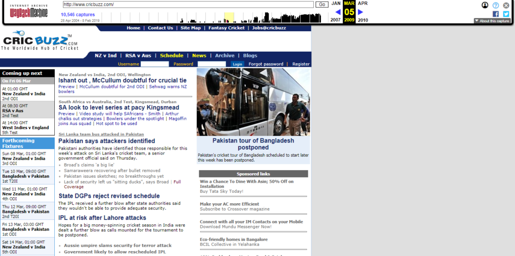
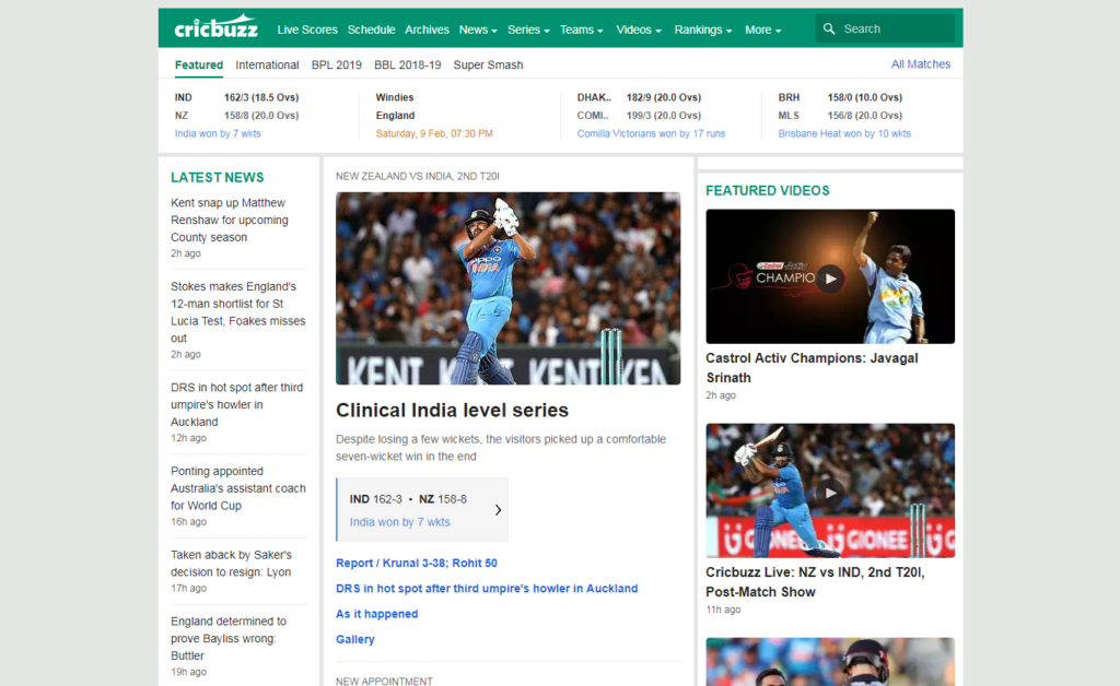
Not much has changed for Cricbuzz in the last 10 years except it finally realized the power of visual media. In a way, it shows how little has changed in the world of cricket (in India), except for a few odd incidents that forcibly blur the line between the players’ professional and personal lives.
IRCTC.co.in
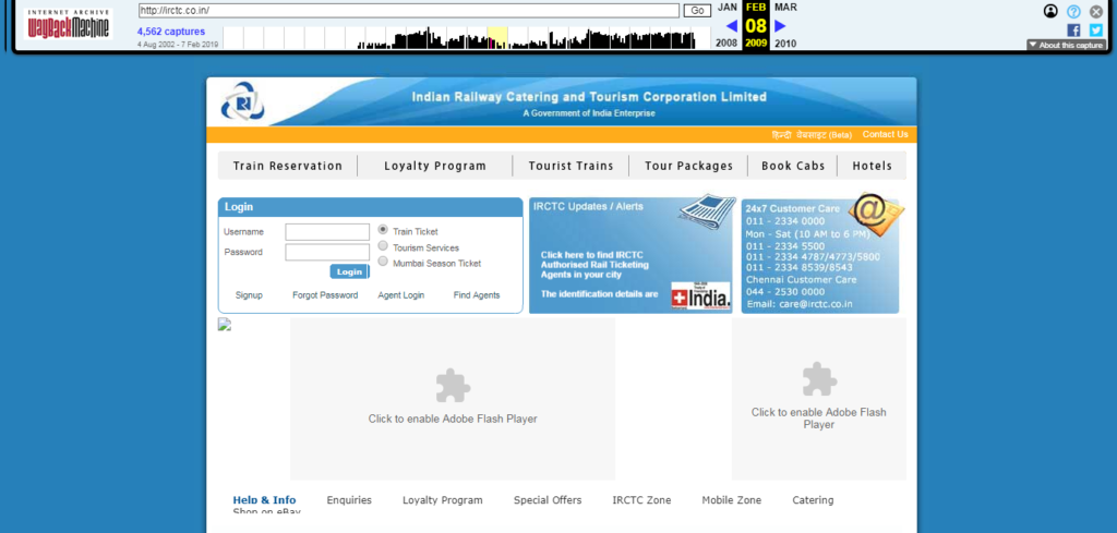
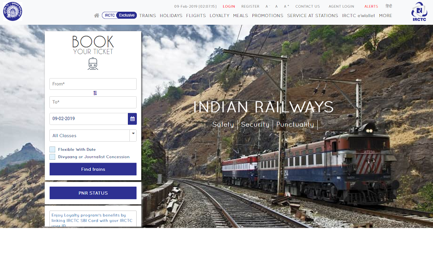
It is good enough for me that the IRCTC website loaded quickly both in 2019 and in 2009 through the Wayback Machine. The minimalist approach at the moment is a welcoming gesture. So is the overall confident look.
Jeevansathi.com
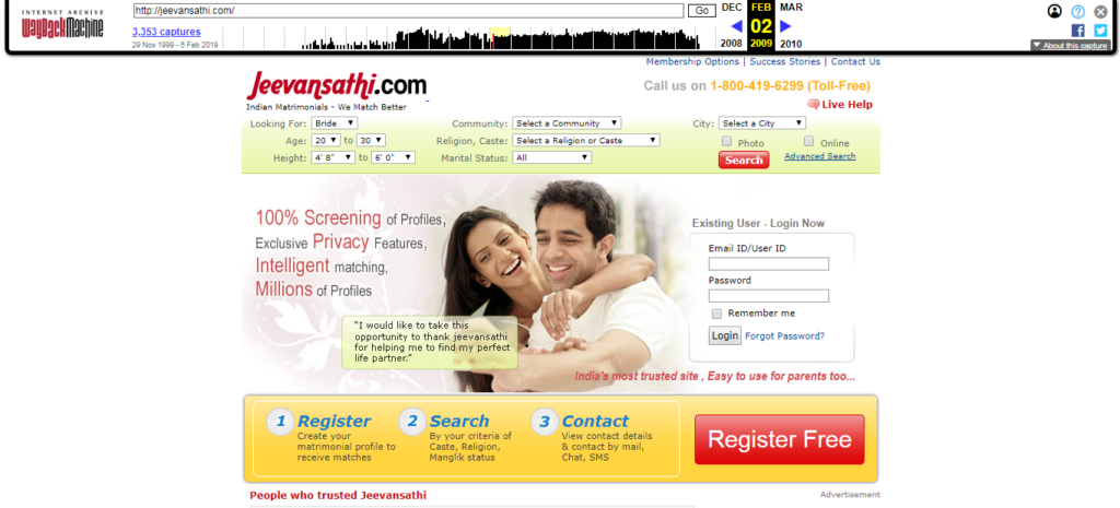
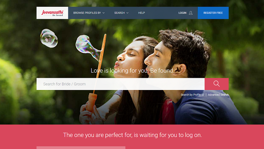
With an ad copy that goes “India’s most trusted site, easy to use for parents too…”, Jeevan Sathi really tried hard to market itself to parents looking mainly for brides for their sons. See the default selection back in 2009 and then compare it with the sleek, cleaner look of the website right now. Would be interesting to see how, if, and when the matchmaker mostly does away with gender specifics.
Jio.com
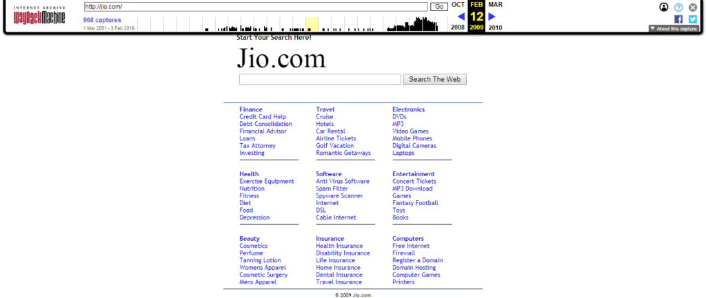
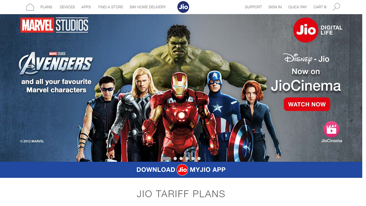
With Jio all I am thinking of is the fat paycheck the original owner of the domain must have received from Mukesh Ambani’s Reliance Industries.
Yatra.com
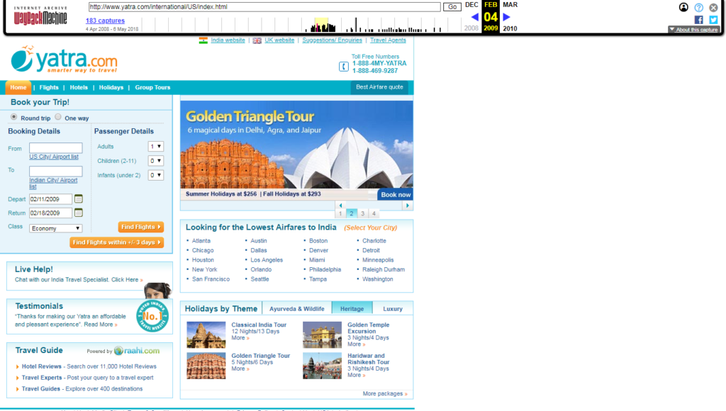
Yatra’s website looked like it took notes from the IRCTC of 2009. And it amazes me to see that the default site loaded for the US market with an option on the top navbar for the Indian version. (Note: Wayback Machine wouldn’t give me a snapshot of the Indian website.)

99acres.com
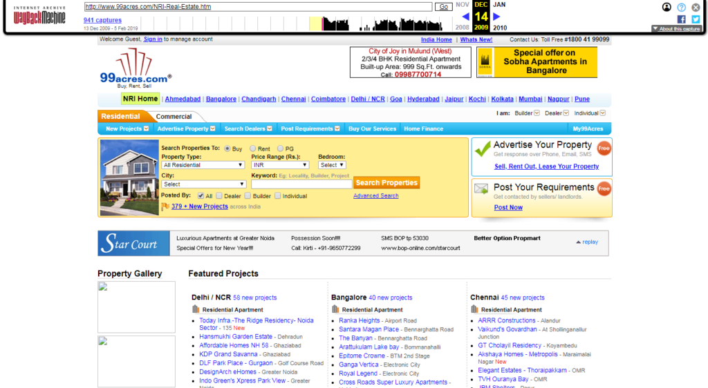
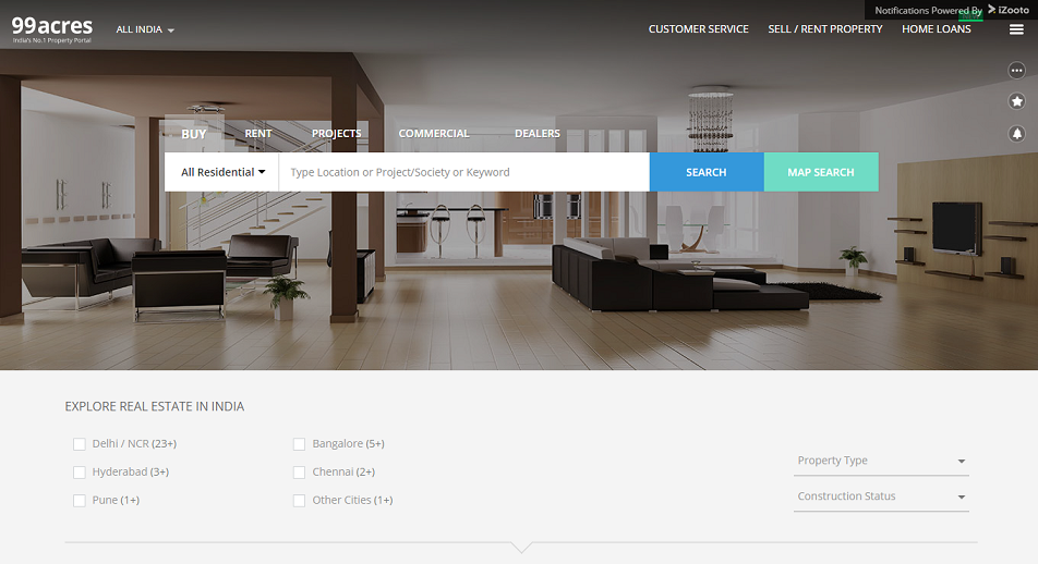
Apart from the iconic logo, 99 Acres also changed its interface. This one for good. The highlighting for ‘NRI Home’ back in 2009 is reminiscent of a period where NRI folks toiled in a foreign country (the Gulf, anyone?) to invest in real estate in India.
Justdial.com
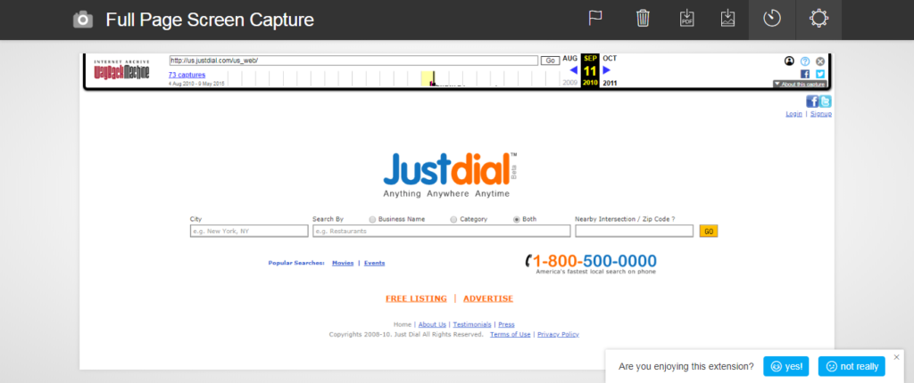
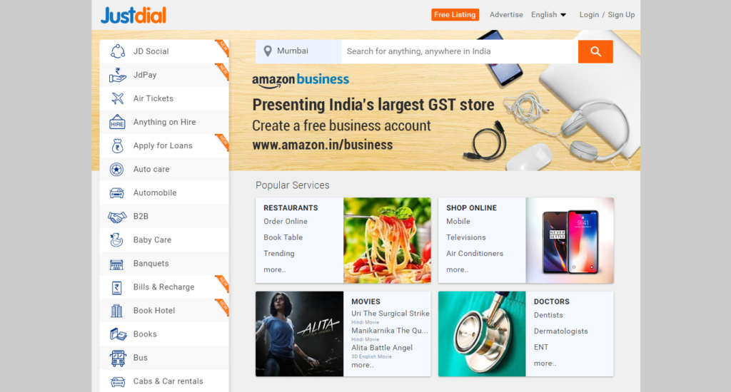
Justdial is the one of the few websites on this list that did not change its logo (apart from doing away with the trademark and beta signs). But it did change its Google-like interface to move to a more visual one similar to how all the ecommerce websites that it now competes with do.
OnlineSBI.com
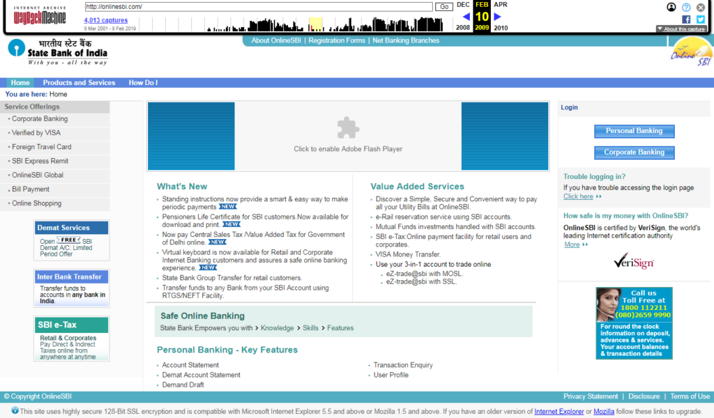
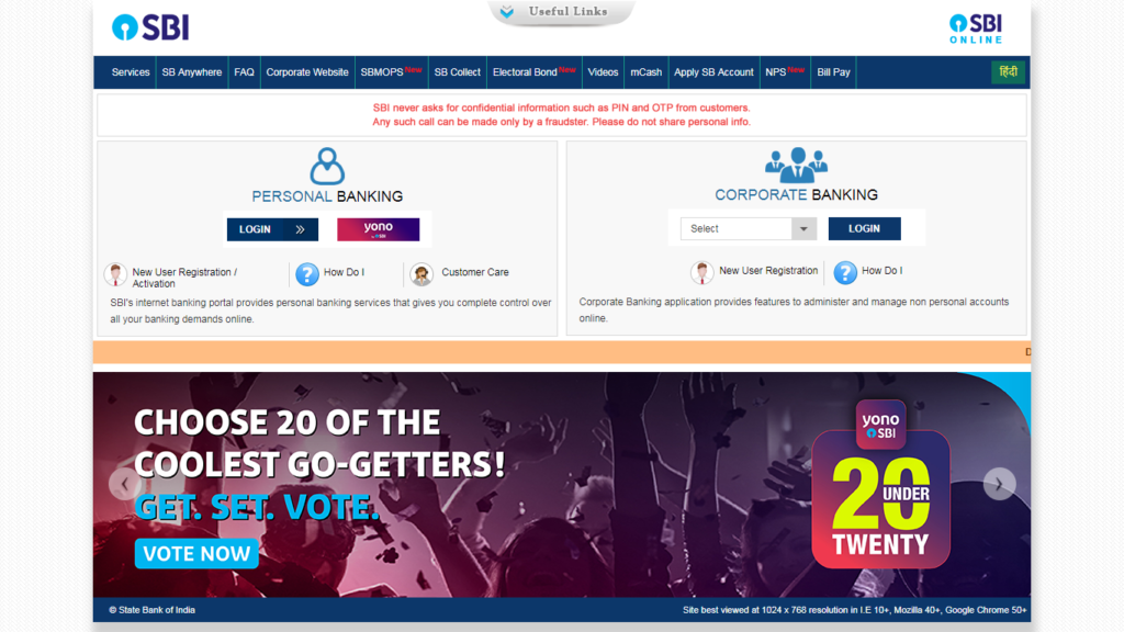
The digital boom really did some good to SBI’s Net Banking portal. In 2009, it had to list its products and services in the menu. And today? It is more about convenient banking and digital applications. No need to even talk about Yono SBI ads of which are just about everywhere on the internet.
Rediff.com
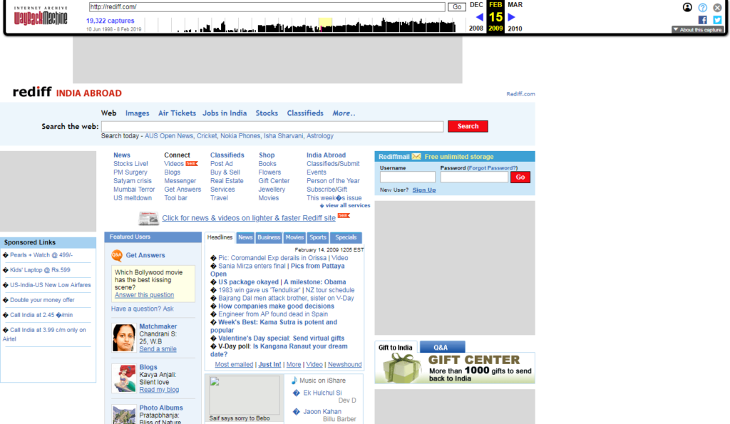
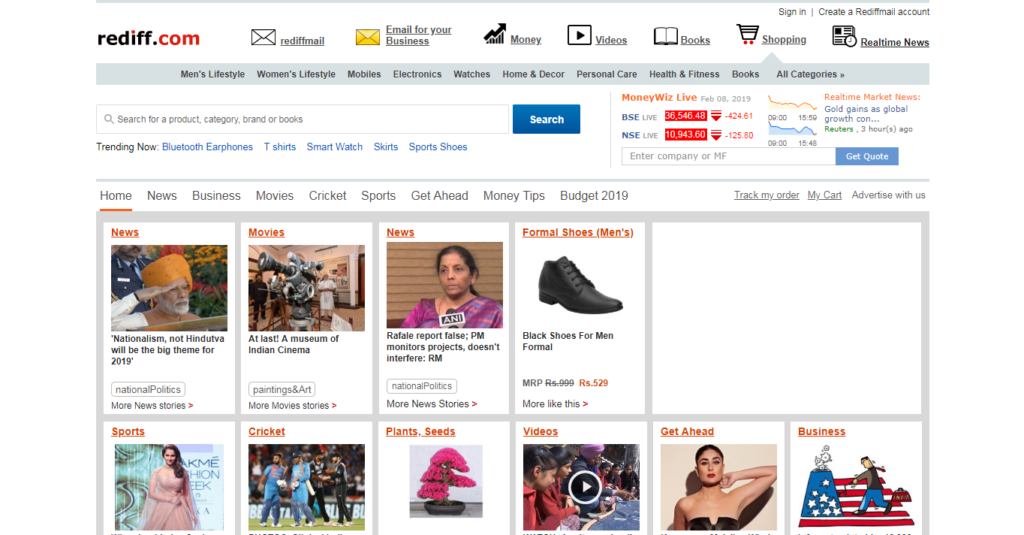
Many people still don’t know why Rediff exists except for its email service. Both in 2009 and in 2019, its homepage hosts a list of links that will take you to anything and everything available on the internet including info about stocks. But the SEO guys handling Rediff.com will tell you that the heatmap is currently focused on the first option beside its logo that has silently changed from just ‘rediff’ to ‘rediff.com’.
Shaadi.com
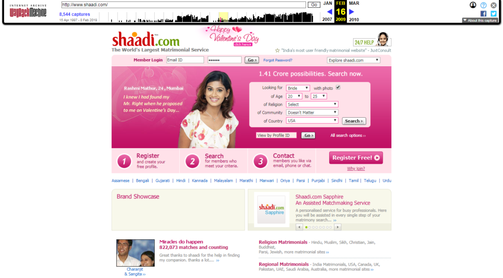
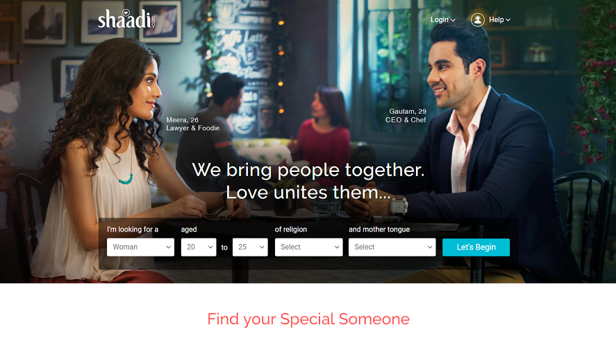
It’s interesting to see how the ‘world’s largest matrimonial service’ did away with an orange sindoor from its logo and adopted a heart sign to express its focus on lasting, romantic relationships than about the conventional institution of marriage. Not much has changed except the homepage now boasts of a cleaner look, just like its competitor Jeevansathi.com and other in-vogue Indian websites.
Naukri.com
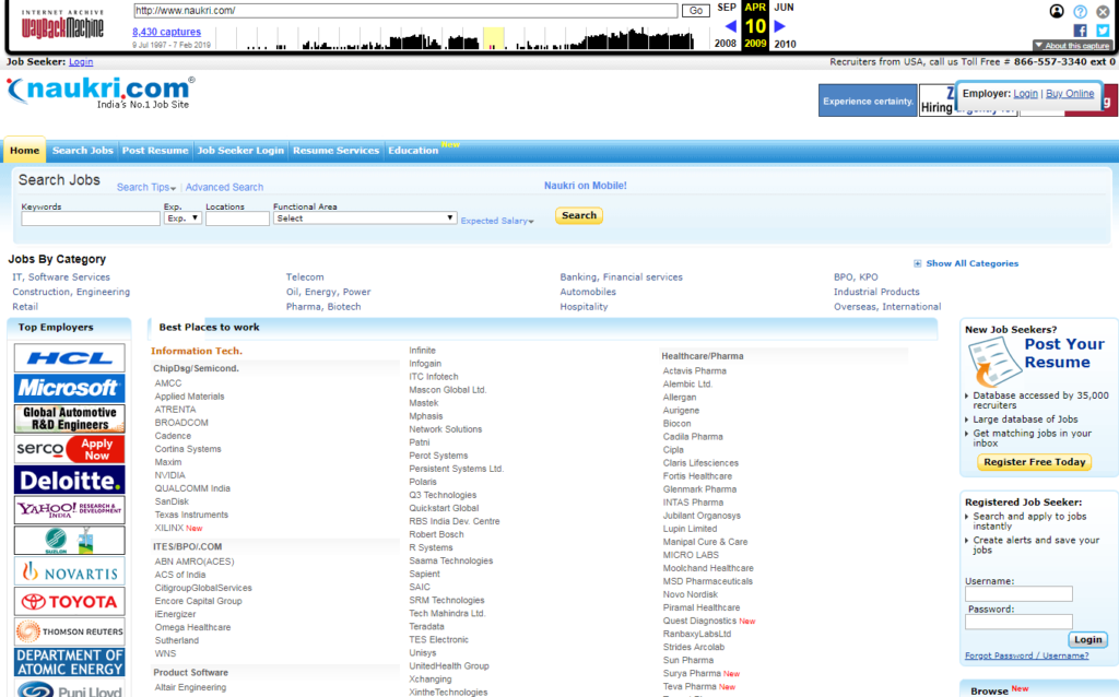
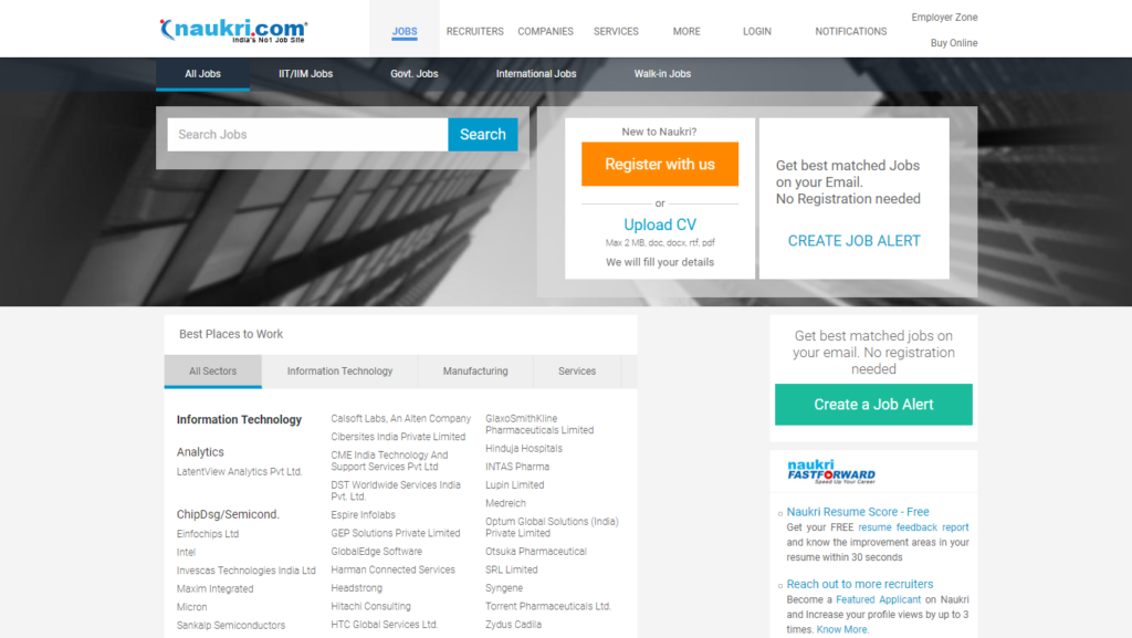
Job portal Naukri.com maintained its relevance by not changing anything from its key homepage design. From the logo to the sections – everything look reminiscent of a time when BPO jobs were all the shiz. Look how the focus shifted from streams of professions to ‘best places to work‘. Hints at how the employment-wanting public think. Today, Naukri.com is not just for people looking for jobs. It’s much more than that with all these spammy-looking links below the first visible space..
MakeMyTrip.com
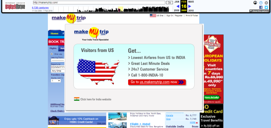
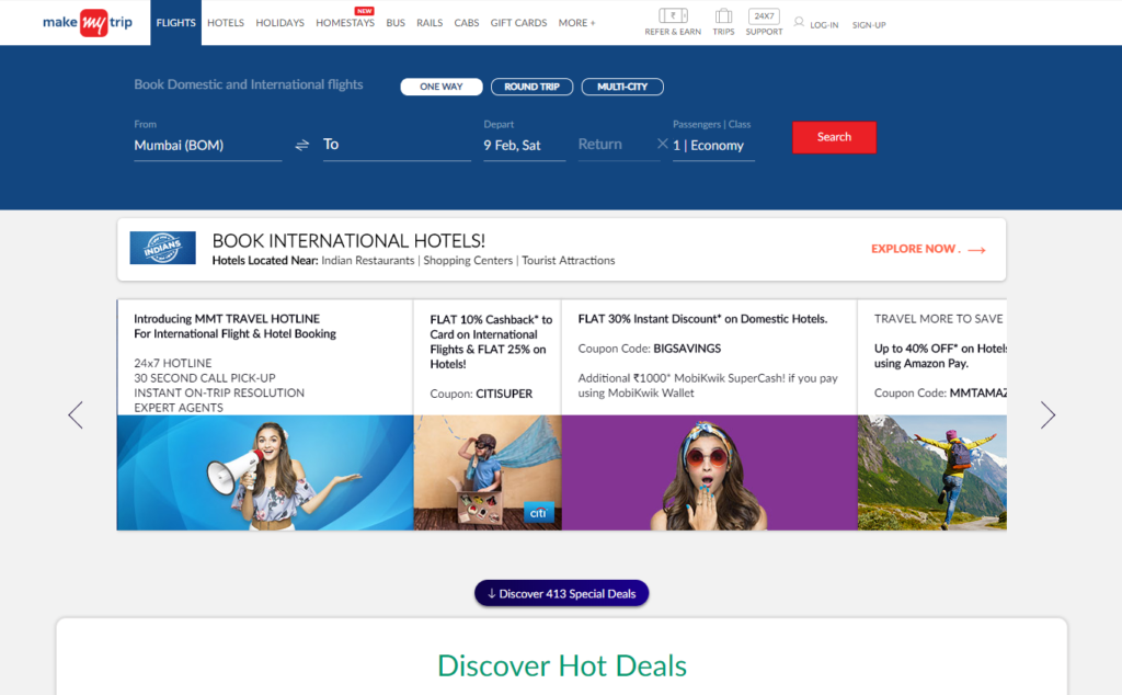
In 2019, the ad-less interface is taken up by MakeMyTrip’s brand ambassador (Alia Bhatt again, here without her beau) talking about wanderlust and discount offers. Not so crazy to see how the aggregator focused on flights more than anything in 2009. And they had to put a splash screen for people to guide to the US/India website. Web technology has evidently advanced but still no change in the website’s draconian cancellation rules and ridiculous processing fees.
BookMyShow.com
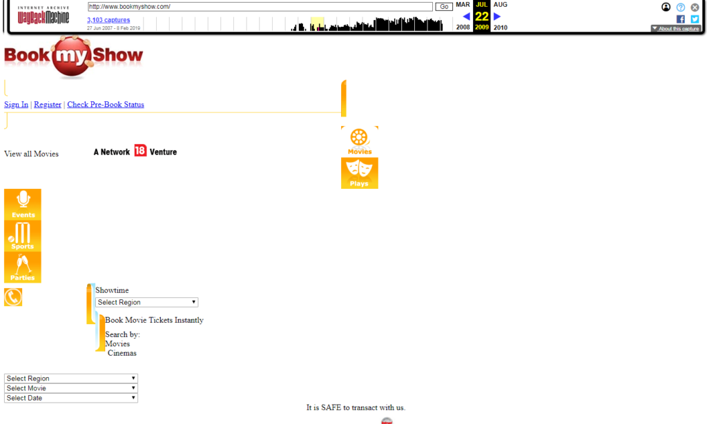
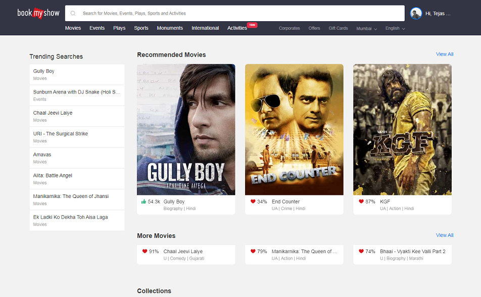
In 2009, BookMyShow (BMS) was just an infant with an interface that looked like a college dropout had got it designed for $5 from Fiverr.com. No huge posters of popular films running in theaters, no flashy ads about Sunburn, no other choices than movies, sports events, plays, and parties. And they had to mention ‘it is SAFE to transact with us’ at the bottom. All hinting at how far BMS has come. It’s good to know that all the internet handling fees that we paid over the years helped.
What other websites do you think demand a feature on this list? Let me know in the comments and I will try to add them. TN.

5 responses to “Indian Websites Take the #10YearChallenge”
Call me a luddite but I liked most of the 2009 versions more than the contemporary ones. Most modern websites are horrendous w.r.t information density. There’s far too many useless elements on each page demanding my attention while the actual content I’m interested in is buried in a friggin’ drop-down tab somewhere. The first thing I’m going to do when I take over as the Grand Panjandrum of the Universe is outlaw Javascript and put all frond-end web developers in HTML-only gulags. All this Web 2.0 design is horrendous IMO. Whatever happened to nice, clean designs that get out of the way without drawing any attention to themselves? I like your site because it’s a sparse page that just serves up content, period.
Are there any big sites that haven’t really changed all that much? I can only think of craigslist. Reddit has its own awful redesign but at least you can still use the old design.
Function over form, man. I’m still in pain from Google’s Material Design 2.0.
I happen to agree with you about information density, Jim, but only to some extent. Maybe because I am an “advanced internet user” (if there is such a term), I dig the 2019 version of some of these websites. It gives me joy to visit these visually striking versions than I did in their previous skin. One reason – and I think this is huge – for the websites to look cluttered is because of SEO. Each of these dozen or so websites I have featured have been severely optimized for the web which demands such wide range of information and over-descriptiveness. But yeah, it still doesn’t justify giving a hostile experience to the user.
I think Google has managed to remain subtle all this while; I rarely visit Craigslist; and yes, Reddit’s redesign is awful (their old skin still gives me internet orgasm).
What’s Google’s Material Design 2.0? I’m not sure if I know what that is.
PS – Thanks for your continued readership, Jim. Appreciate it.
Ah I like pretty bells-and-whistles too at first but it is often the case that with elaborate designs come slower loading time, more megabits of data loaded per page, and just an overwhelming feeling. I suppose this is a personal thing, really, so we might have different opinions. You’re right about the SEO stuff, though. That’s a good point I hadn’t considered much.
Google is nice and sparse but they keep screwing around with their other apps all the time, which is what Material Design 2.0 is. I’m not sure if I’m allowed to add links in this comment section (spam filter might bork it), but basically Material Design is this set of design philosophies and guidelines created by Google for Android app developers. The original Material Design (1.0) was something I liked, but the recent update to 2.0 is horrendous, IMO. I would recommend googling ‘material design 2.0 Ars Technica’. The very first result is a good overview.
Also, you don’t have to thank me for nothin’. Your blog is pretty neat which is why I keep checking in once in a while. Heck, if you have a Patreon or whatever, I’d be happy to contribute once in a while too. Also, please, just ‘hugh’ is fine. Or ‘Mr. mungus’ if you’re feeling particularly formal. The ‘Jim’ from my email ID is just a ‘Community’ reference.
I’ll have a look at it, thanks. Also, I appreciate you willing to contribute, Hugh, but I have never thought of putting up a paywall on here. Maybe a “Buy Me a Coffee” widget at some point of time. But to be honest I have an extremely low readership at the moment, which is where my gratitude was coming from. 🙂
[…] am a sucker for logos the same way I am a sucker for movie posters and design. So, when the idea to create this list struck me I immediately began collecting good-quality image […]